Tuesday 21 December 2010

Jean Shrimpton number 2

This is my image of Jean Shrimpton re-vamped and had photoshop treatment!
As I was sitting at the computer with this image infront of me, I thought to myself what could I do that makes it come alive? Something simple but yet effective and I just chose a colour, put it in the background to see how it looks...
I really like it. It reminds me of a poster from the 1960's, which isn't a bad thing!
Even though there is the rather bright colour one can still see the beauty of the ink wash that I produced in the hair etc.
This is one of my favourite images that I have done this year, so far, and it is going into my portfolio!

Steven Stipelman- Fashion Illustrator

I am extremely excited about meeting Steven Stipelman!
I have been lucky enough to be told that the Professor of Fashion Illustration is giving a talk and a class about this subject! This is my passion and am over the moon to be meeting him.
It's on my birthday so what a wonderful day I'll have!

3 Other Images and Small Evaluation.

Here are some more images that I did before my final 3 were completed.
The first one didn't need anymore work doing to it so I played around with the text, what font/size/situated etc. The other 2 are not disimilar to my final ones but maybe one can see what I changed...
The 2nd one, for the hot sun was, in this case, a huge coffee ring, continuing Meursault's love of coffee, but for some reason it just doesn't work as well as the cigarette burn. I do like where the text is situated but for the final piece I decided upon putting the text at the bottom of the image so one can see the whole image.
What's wrong with the 3rd image is the guillotine. It is not my best drawing and doesn't fit in with the other 2 very well.
I have really liked this brief. It has been a challenge, but a good one. I enjoyed the story, which always helps, and now am introduced to a great and gifted author.
As I have said previously, I would have liked more time on it but with the time I have had, I think that what I have done is good. One image inparticular...
I don't know for sure if these images are good enough to enter the competition, I shall see when I get my marks back.

Cover and Spine


For the front cover and spine I have decided to go very plain and simple, straight forward. As I think the main character is.
The front cover is layers of old paper which I mentioned in the previous post with cigarette burns and white coffee rings, repeated over and over again.
The spine has the exact same thing, with the paper and a piece of masking tape situated under the name of the author and title.
I am rather pleased with the outcome and think it fitting well with the nature of the story and the main character, Meursault.

My 3 Final Images for The Outsider


Here are my final 3 pieces for the Outsider book.
I had some fun with these images, I got to draw with ink a lot, which I love to do and also go onto Photoshop. My aim was to produce a number of images really quickly on Photoshop, just like I did by hand and to see what I came up with.
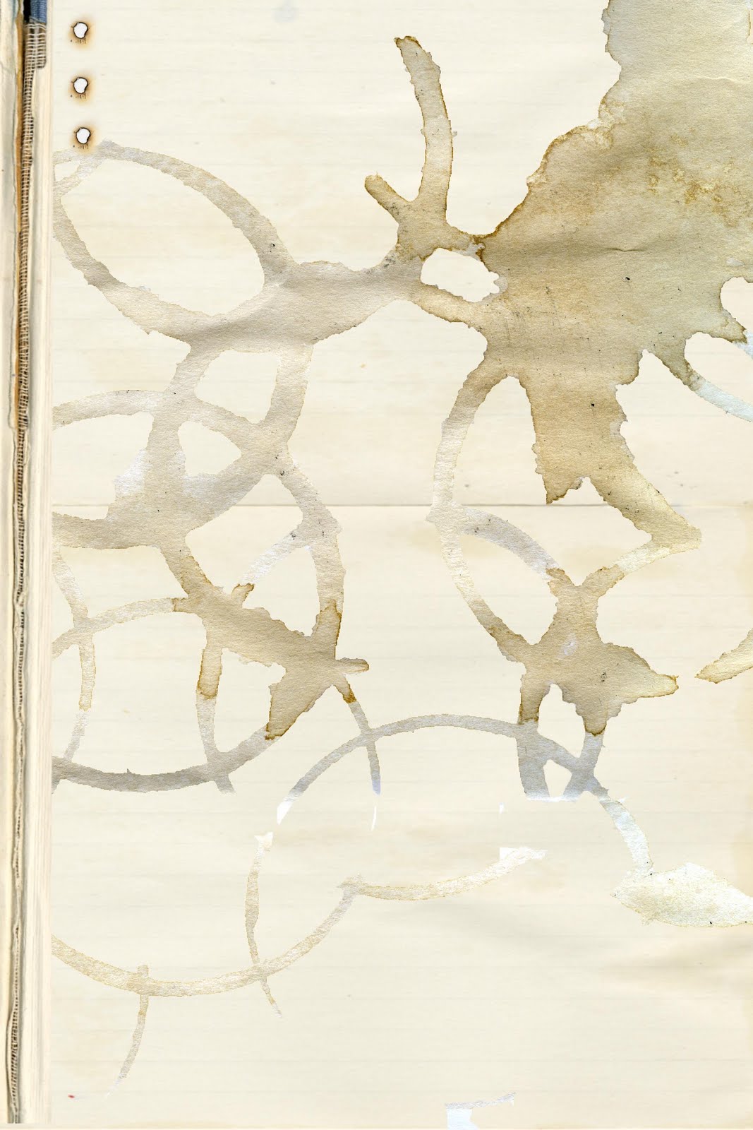
The 1st image, the cigarettes in the ashtray is my favourite. I had an idea in my mind that I would illustrate this as Meursault constantly smoked throughout the story at 'strange' times and thought this was interesting to his character.
I love to work on different and random pieces of paper and with photoshop that is easier for me to do. I draw everything by hand and then play on photoshop where I uploaded a number of old/tatty/diguarded paper.
The 3 of them are on paper which gives a rustic look to the images.
I also picked out how the main character drinks white coffee all the time so I decided to put these two things together- an ashtray surrounded by constant coffee rings.
I think this is the strongest out of the 3...
The 2nd image illustrates the time when Meursault shoots the man and is very aware of the heat around him and the sun, beaming onto him. So here comes the paper, with dried tea on it, to give the effect of the sand. The water at the bottom is actually Algerian water over the top of graph paper. On the right hand side there are 4 small bullets that stand for the 4 shots Meursault takes at the man.
The main thing in the centre is a cigarette burn. I thought this would be perfect to in-corparate his passion for smoking, and the burning of the sun.
The 3rd image is based on the last part of the book (I have tried to even the illustrations out) when Meursault is told that he would be 'decapitated in a public place in the name of the French people.'
I wanted the guillotine to be the main object within the image, as the others have all got one main object in them. I spent 2 days drawing/ painting and using ink to produce the perfect guillotine and out of the pages I completed, this seemed to be the one which worked.
The guillotine is such a strange thing. It is rather an elegant piece of machinery but has such horrible consequences! I took my images from old fashioned ones and what would more likley be used in that age in Algeria when the book was sent to print. ( The author does not specify when the book is set so I went by the publishing date.)
This guillotine I hope, is rather intimidating as it's black, tall and up close to the viewer. I think this is what I wanted it to look like but to be honest I would have liked more time to adapt it and maybe get it looking better.
But on the whole, I am rather pleased with these images and how they have turned out.


Wednesday 8 December 2010

More covers for The Outsider...


These are two of my favourite book covers for Albert Camus' The Outsider. I love how dark they are, which the story is.
I don't know who made them, that is further research that I must do, but even so, they are remarkable.
My favourite is the top one.
From other covers that I have last seen, they are nowhere as... dark, as these two.
The top one is great. I love the black background with the red drips of paint, which resembles the blood that Meursault has produced when he shoots.
One can't see a figure of a man on the cover but one can see he's there and I can't make out what the face, if infact it is a face, at the top of the page.
The bottom one is very disturbing. It screams out death and sadness.
Now I have seen these previous covers, it gives me an idea of how dark I can go when designing the cover.

Albert Camus' The Outsider


For further research for this project, I have decided to look at a few previous book covers for The Outsider.
These 2 are rather plain, rather boring. I don't like the 2nd book cover as I don't think it tells one anything about the story, and as I am sure that I am not the only one, I prefer a cover that gives some insight into the story.
The first one is rather plain but I do like the simpleness that this one has.
I really like the limited use of colours that has been used and what looks like, old papers printed on the book.

Traditional meets digital


This is another image of a figure I produced a couple of weeks ago... I was pleased with the outcome of it, but felt like it needed something else. So I headed to photoshop and tried to come up with something that was half decent.
(This is before I spent the day infront of the computer and tried to teach myself the ins and outs of the programme!)
And what I came up with was this. A plain pinkish background that sits comfortably next to the figure.
I realise that it doesn't take a genius to do this basic act on photoshop, but I think that because it's simple, it does add an extra depth to the final image.

Business card and bag

Here are my 2 images, which I am very pleased with, for my business cards and for my object.
The other day, I sat quietly at college, on my own infront of the computer on photoshop. I am known for not being photoshop's biggest fan, but whilst on my own, I managed to teach myself and have become very much more confident with it.
So, here are my finished images, which are done in the tradional way of hand drawing but touched up with the wonder that is photoshop!
I just hope that they look as good on the bag and the cards!
We'll see...

Cigs...


As mentioned in other posts in this section, I am looking at cigarettes and matches, as Meursault smokes an awful lot in the story by Albert Camus.
So here, is images of cigarettes, some done by hand and then rotated etc on photoshop, which I quite like to use.
He drinks a lot of coffee, white, which I have used to paint the filters on the actual cigarettes, which looks quite good.
The big image on the right hand side had been dobe with ink and water, not one of my favourites, but I do like the shape that I have created with it.

First page of research


For the first week of being given the competition brief, I set about doing some written research on the auther and the story and thought it a good idea to post a page on my blog, as I have seen other illustrators doing so.
My intention, as I hope one can see, is to turn my written research into art.
My thing at the moment, which I love working with, is actual materials, for instance, tea and coffee... so this page is cluttered with liquid and ink.
My sketch book is filled with pages like this, but am obviously not going to show it all as I will be scanning in for a very long time!

Tina Berning- 'esque'


This is a simple sketch I did not that long ago...
It's done on old paper and mounted onto a black background. I quite like this as it shows that I can just draw fast with a pencil and able to produce a rather good image.
As the title suggests, it is rather Tina Berning inspired, not intended, but is how it has turned out...

Jean Shrimpton...


During my drawing 'marathon', I produced this image taken from an image of Jean Shrimpton.
It is just made with ink, straight on paper.
As one can see, I love how the ink has made texture marks on her hair which I think adds something.
I had never worked like this before, ink straight onto paper before, and this was made after about 10 drawings later when I was extremely comfortable using my brush.
I just proved to myself how once one produces lots of drawings, there is always one that comes out best!

Inspired by Tina Berning


Earlier on in the year, I, as mentioned in other posts, kept on drawing everyday. One of the images I produced was this one, very influenced by Tina Berning.
To start off drawing, I looked constantly at Berning, which is seen here, and I started to get my own style which one can see in other posts.
This image is done on tracing paper made with ink mixed with water. I really like working with tracing paper and ink as the paper is flat and doesn't let the ink and water soak in straight away so I was able to create this effect with the drips.

Wednesday 1 December 2010

Cigarettes and the Guillotine


As I have mentioned in my previos posts, I am focusing on the objects throughout the story, the first being on coffee, and throughout the story, Meursault smokes an awful lot.
With this in mind, I want to illustrate this. So I have been looking for ways to draw cigarettes and ashtrays, taken from photographs and not illustrations that already exist.
These two at the bottom are quite realistic to draw from and I really like how one image is taken from the side and the other from above so one can see the used cigarettes inside the ashtray.
I realise that this isn't the norm to be drawing this, and in a way is rather crude, but the story is so direct and Meursault doesn't care what anyone thinks and does it anyway, which I supose is what I am doing...
The last part of the story has Meursault executed by way of the guillotine. I was not that familiar with this, how one looks etc, so I researched what one would look like at the time the story was published and if one was different to what one uses in Algeria, which is where the story is set.
The bottom one is French, a rather old one and the one above is quite, if I may say it, a nice illustration of one. It captures the mood of what it is used for and the composition is rather interesting.

More cups...


One of my favourite illustrators at the moment is Alice Tait and whilst on her website I saw this image, the second one. She has such a delicate way of working which incorparates beautiful water colours. She paints everyday objects and puts them into lovely compositions.
These here are tea cups but I supose that one could drink coffee in them!
The image above this one is just as nice, but I am not sure who the artist is which is a shame as I believe that such a wonderful piece of work deserves a name!
I love just how the page is full of cups and sources in all different colours and patterns. Some are rather detailed and if you look closely there are some which are just simple.
Looking at these two images gives me an idea for my own work which gives me some inspiration.

Coffee cups...


For the competition brief, I have decided to look at the objects that occur throughout the The Outsider, rather than the figures. I wanted to move away slightly from the body etc as I feel that I have worked on them enough at this time, for instance with my last project. That does not mean to say that I shan't be drawing them as I in my own time, say if I'm doodling, figures are what I love doing.
So, during the first chapter of the story, Meursault's mother has just died, and it's safe to say that he is not grieving in the usual way, and sits down in the room where his mother is in the coffin and he has a cup of white coffee and a few cigarettes. This I feel is rather important as it shows what kind of person he is.
I took the liberty to have a look at some coffee cups, very simple I know, but I want my illustrations to be that. Clean and simple, straightforward as this is the impression Meursault has these points.
The bottom two of the cups are pure and simple shapes that I want to convey and the one at the bottom is my favourite. It is from the Victoria and Albert Museum, part of their range and I think it's beautiful. The patterns on it are lovely and I am in two minds whether to have patterns on my own image. But, as I have mentioned before, the story is very simple and straightforward, and I think that maybe too detailed.