Showing posts with label PDP. Show all posts
Showing posts with label PDP. Show all posts
Tuesday, 10 May 2011
Clients, Network List etc...
Just a note to say all my PDP infomation are in a book, not on this blog as I want to respect the confidentiality of the people and companies that I have spoken to.
Tuesday, 21 December 2010
Steven Stipelman- Fashion Illustrator
 I am extremely excited about meeting Steven Stipelman!
I have been lucky enough to be told that the Professor of Fashion Illustration is giving a talk and a class about this subject! This is my passion and am over the moon to be meeting him.
It's on my birthday so what a wonderful day I'll have!
Thursday, 30 September 2010
Vogue
 Who I would love to work for would be the almighty 'Vogue!'
I was on their website the other day and saw some fashion illustrations on there. A couple featuring David Downton and Jason Brooks.
For years now it has been a 'dream' of mine to illustrate for them!
I have looked at alot more industries and illustrators for my PDP which are in a little black book instead of them being on the blog.
Green Eyed Over...

 I came across Egon Schiele a few years ago and he has been, and still is, one of my favourite artists.
As I have said in previous posts, I adore Tina Berning's work, and I came about this piece the other day and it immediately reminded me of Schiele's work.
Maybe she is inspired by him?
There is evidence on both how the lines are so similar- thin, flowing and both in black which gives it a harsh but yet gentle outcome.
Berning has used more colour on hers than the original of Schiele's, but both are very limited to colour.
I would love for my work/ drawings to be as good as these, and that is why I am 'green' with envy!
Tuesday, 28 September 2010
Green Eyed Over... Travilla


I have an obsession with fashion illustration and I get very excited when I come across different types of illustrations!
I came across William Travilla last year when I was writing something for critical studies, and then saw his own sketches of Marilyn Monroe in the dresses that he designed.
They have a delicate quality about them, very sensitive and captures Monroe in a different light.
Green Eyed Over... Berning.
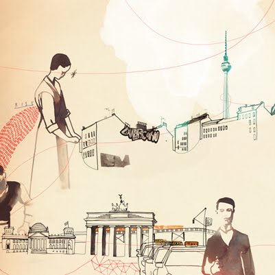 Another 'green eyed monster' for me is Tina Berning's work. As I have said on previous posts, I adore her way of working.
I love the fluidity of the lines she creates, very sensual and pleasing to the eye.
During my project which I am working on now, she plays a big part as my inspiration. Sometimes there is just one image of a woman's face, which is placed very simply on the old paper she uses. Other times, like the image above, there is so much going on with in the piece that the eye moves around the page, but yet this isn't over powering. I love how there is something to look at where ever one looks.
This one caught my eye especially as it is different from the norm of her style.
Limited colour pallet and mixed mediums- pen/ink and water colour which I work with.
This image is of Berlin in Germany, which I am hoping to visit in the near future and whilst I am there, or any other city for that matter, gives me the idea of sketching and making some work of my own...
Without a doubt, I am very envious of this piece!
Green Eyed Over... Abram Games

I am completely envious of this poster by Abram Games, 'Join the ATS.' He was the official war artist of the second world war and produced this poster in 1941.
Last year I did a semiotic presentation on this image and was able to enjoy going into great depth of research which 'kick-started' my obsession of this piece. (All of his works are fantastic, but this one just 'takes the biscuit!'
This image is so iconic... it was used during the Second World War and was an act of propaganda to get women to join it.
He takes a 'blond bombshell', probably taking inspiration from the actresses that appeared during that time.
First of all, the colours stand out. They seem to fit very well even though they are rather basic ones. Very patriotic...
The part which makes me really envious, is the woman's face! So simple lines and curves which makes her very attractive!
He makes that look so simple and I have a feeling, from experience, that it probably took numerous attempts to get the perfect finish!
I just adore this whole poster. The composition is beautifully simple and yet stands out, perfect for the time it was made. Through a dark time, it must have been nice to see this on a bill board etc, as it would cheer one up, even if people didn't want to join the ATS.
I wish that I could produce work like this, strong, powerful and as I have said before, beautifully simple!
Abram Games is definatley a inspiration to me and my work and I hope to be able to produce images as good as his!
(Well, nearly as good as his!)
Subscribe to:
Posts (Atom)